Saturday, 30 April 2011
VIRAL CAMPAIGN
I created a Facebook profile for the main character of my film trailer as well as creating a page for the film 'DISCONNECTED'
The reason i created a Facebook profile of the character is to create a 'realistic' view of the film. For the film page, it is useful because people are able to view and like it as well as find out information about the upcoming film. As well as this; the viral campaign can be uploaded to the page.
Tuesday, 26 April 2011
EXPERIMENTS
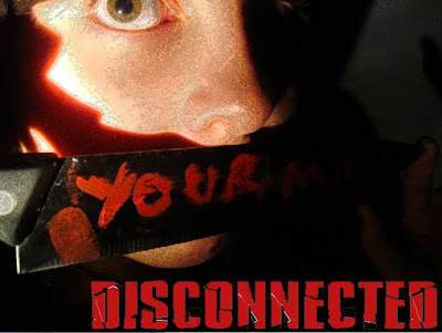
This is a mock up of a landscape poster with the text at the bottom of the page. I dislike the look of this because it doesnt look professional, however i like the picture because the eyes stand out and there is a sense of fear in them.
CONCLUSION OF ANALYSIS
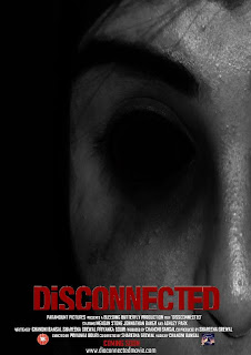
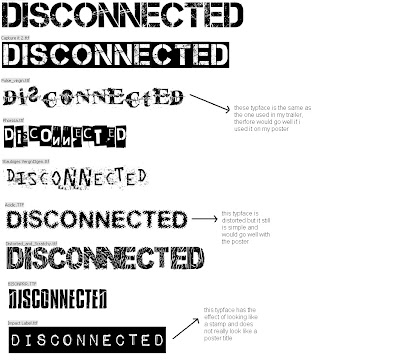
The overall theme of horror posters are the 2 main colour conventions which are red and black. There also seems to be a large image, possbily enigmatic, which takes over the whole poster. The typface seems to be generally simple however could be distorted in some way for emphasis.
Subscribe to:
Comments (Atom)


