EVALUATION on Prezi
Tuesday, 3 May 2011
Saturday, 30 April 2011
VIRAL CAMPAIGN
I created a Facebook profile for the main character of my film trailer as well as creating a page for the film 'DISCONNECTED'
The reason i created a Facebook profile of the character is to create a 'realistic' view of the film. For the film page, it is useful because people are able to view and like it as well as find out information about the upcoming film. As well as this; the viral campaign can be uploaded to the page.
Tuesday, 26 April 2011
EXPERIMENTS
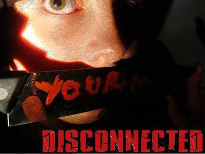
This is a mock up of a landscape poster with the text at the bottom of the page. I dislike the look of this because it doesnt look professional, however i like the picture because the eyes stand out and there is a sense of fear in them.
CONCLUSION OF ANALYSIS
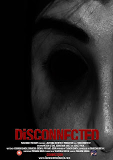
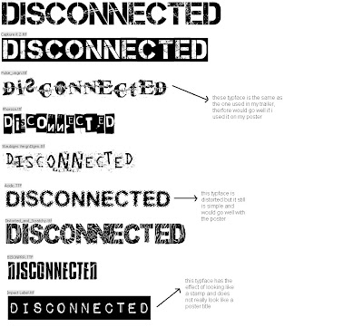
The overall theme of horror posters are the 2 main colour conventions which are red and black. There also seems to be a large image, possbily enigmatic, which takes over the whole poster. The typface seems to be generally simple however could be distorted in some way for emphasis.
Wednesday, 16 March 2011
MAGAZINE MOCK UP's AND AUDIENCE FEEDBACK
This magazine cover is good because of the layout of the text at the top, this follows conventions which is effective. The image is not very professional as it looks like part of a CCTV camera. Therefore this image could be changed to a better, clearer one.

This magazine is an almost finished version and i think the colours are very effective and stand out from the image. It follows conventions for example the colours, barcode and the writing on the left third. However the image is not very clear and could be edited, or it could be seen as enigmatic which is a convention of horror.

This magazine is an almost finished version and i think the colours are very effective and stand out from the image. It follows conventions for example the colours, barcode and the writing on the left third. However the image is not very clear and could be edited, or it could be seen as enigmatic which is a convention of horror.
AUDIENCE RESEARCH- MAGAZINE
I asked several people to answer a questionnaire about horror magazine covers and these are the responses i got. I used a questionnaire because it is an easy way of gaining information and the reason i used Facebook is because my target audience use web 2.0 and are easily accesible on there.
Audience research is important to gain feedback on the what should or should not be included in the product. These answers show an overall idea of what i would include in my magazine cover, most of which are conventions.
Wednesday, 2 March 2011
Tuesday, 1 March 2011
MAGAZINE MOODBOARD
It is very clear that the main colours which stand out are red, black and white. Therefore if i choose to follow conventional colours i would pick one, or all of the above colours. However, if i choose to have a non conventional magazine cover, i would use other colours such as green which is clearly seen in one of the covers above.
Wednesday, 16 February 2011
Tuesday, 15 February 2011
Friday, 11 February 2011
Conclusion Of Analysis
What i have learnt overall from the magazine analysis is that there are many typical conventions. The main colours i would be looking for if i was sticking to conventions would be red black and maybe white. Also close ups of people to show expressions and sometimes blood is used for extra emphasism. Depending on the audience, the typeface and layout would change. For example for older more mature audience, the masthead would be simple and bold and the layout would have minimal writing. Therefore if i want to stick to conventions i would use the typical colours. My audience is teenagers to young adults therefore i dont want to have the magazine cover busy but not too simple either, so i would have to find a good balance. As for colours i like the idea of black and red to stand out.
Tuesday, 4 January 2011
Subscribe to:
Comments (Atom)


